
Your Identity Map: A New Interactive Tool
My new online tool helps you map your social identities and discover how your feeds may be reinforcing your biases.

If you’ve been reading Misguided for a while, you know I talk a lot about social identity. In a previous post, I described how having a diverse set of social identities can actually protect us against misinformation, a concept known in social psychology as social identity complexity.
The short version: when our identities heavily overlap with each other, a challenge to one (such as seeing factual information that makes us uncomfortable) can feel like a threat to our entire sense of self. That defensiveness makes us more vulnerable to false information that reinforces who we are. But when our identities are more distinct and independent, we have a broader foundation to draw from, and we’re better equipped to evaluate information more openly. I explore this in more detail in my book and discuss it regularly in talks, but I wanted to create something actionable that people could engage with directly.
Today I’m sharing a new interactive tool to help you explore your own identity map!
Introducing the Identity Map Interactive Tool
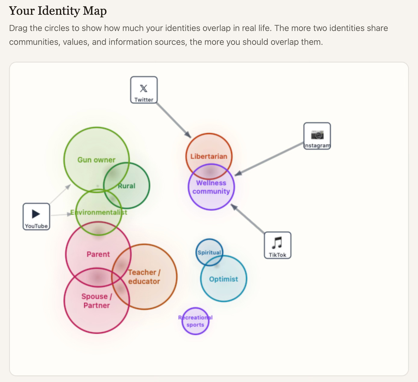
My Identity Map tool is a free, browser-based worksheet that walks you through five steps:
Select the identities that feel genuinely true to you
Rate how important each identity is to your sense of self
Choose your social media platforms and identify which identities each feed amplifies
Drag your identity circles to show how much they overlap in real life
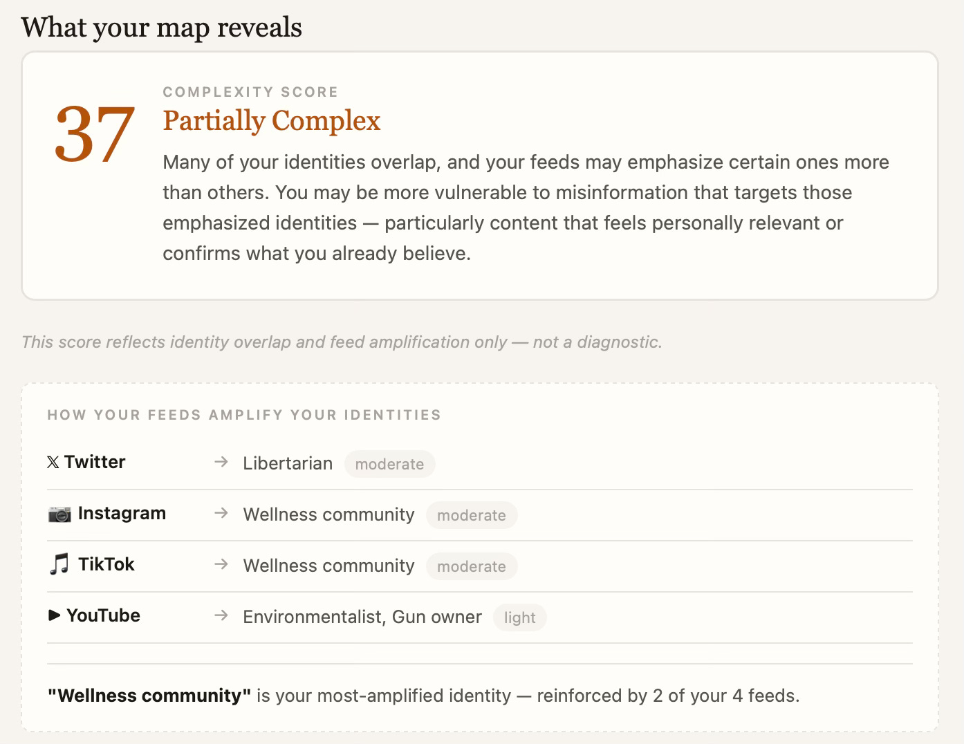
See your Complexity Score and reflect on what your map reveals
At the end, you’ll get a Complexity Score and three reflection questions designed to help you think critically about your identity profile and your information environment.
→ Try it here: matthewfacciani.github.io/identity-map
A few important notes: this tool is designed for reflection and educational purposes only. The scores are rough estimates meant to prompt thinking, not precise measurements. Think of your identity map as a mirror, not a diagnostic tool. The exercise is grounded in research by Roccas & Brewer (2002) on social identity complexity. I also drew inspiration from Peter Coleman’s book and exercises on social identity mapping.
The Identity Map works on mobile too, though the desktop experience is better. On mobile you can’t drag the circles, but you can still rate the overlap manually. This is also version one, so I’d love your feedback as I continue to improve it. There is a Google form at the end to share any feedback you have directly with me.
Share your complexity score in the comments or on social media with #IdentityMap — I’d love to see how your maps look!
I have a few other interactive media literacy tools in the works. Stay tuned!
My score was 37, which surprised me a bit. One challenge in interpreting my social media engagement is that, while I tend to lean liberal, as an educator, I choose to observe a wide range of political perspectives, which I document and bring into the classroom for discussion.
Similarly, although I am an atheist and follow several content creators who focus on deconstruction, I also engage with a few progressive pastors.
I am not sure how these kinds of nuances could be captured or accounted for in this exercise.
My social identity complexity score is 38 (Partially Complex). This is about what I thought I'd find. It made me realize that part of the reason I miss teaching and singing in a community choir is hearing and debating different ideas. My social life has narrowed to mainly just church. I think I need to think about how I can broaden my circle.